Design Harmony: Crafting a Design System​​​

Lead out in creating and implementing a design system; researched industry standards, collaborated with fellow designers, product managers and engineers to create user-focused components. Supported in the building of components, and assisted in proper implementation across the organization, using data to lead iterations of components.

NEW product

FamilySearch, a nonprofit organization with nearly three decades of history, resembles numerous other companies with multiple product teams. With many cooks in the kitchen, the designs across the site were inconsistent and varied from team to team, leading to a confusing and challenging experience for our users. The concept of a Design System was envisioned, and as a Figma Wizard, I eagerly embraced the opportunity to tackle this project head-on.

Summary

  • Researched successful design systems and their structures to create a design system that could scale across the organization. Gathered all the variations of assets and components across the site and interviewed users to find pain points in the existing features.
  • Interviewed stakeholders & combined the synthesis of user pain points to define design system requirements.
  • Created new components & improved or combined existing ones while assigning fellow designers to work on components they used in their own features & products.
  • Performed usability tests on large components and created documentation around each to help designers and engineering teams properly implement designs.
  • Created a Figma library for designers to adopt these designs.
  • Supported proper implementation by working with multiple engineering teams creating the components and held trainings for 50+ designers on how to use the design library.

Research

I conducted extensive research on established design systems like Google’s Material Design, Apple’s HIG, IBM’s Carbon, and others, immersing myself in their guidelines, styles, colors, typography, and more to gain a deep understanding of the required assets for building a design system.

Subsequently, I initiated the creation of a comprehensive master list encompassing all necessary assets and components for the site. This list was then shared with fellow designers to collaborate on adding the required components. 

In addition to collecting examples of existing assets to inform new component designs, I facilitated user interviews to identify pain points with current components. These insights were instrumental in guiding the requirements for the design system, ensuring it addressed user needs and aligned with established standards for consistency and usability.

Stakeholder & User Requirements

I collaborated with essential stakeholders, including the VP of product design at FamilySearch, as well as design principles and product teams, to define requirements and initiate the development of the design system. This involved selecting colors, fonts, and styles that were accessible and inclusive, while implementing versatile dark and light modes to ensure flexibility and consistency across the platform.

Building Components

While I personally tackled many components, I also delegated other significant components to a team of designers to foster collaboration and address existing and future use cases. This approach boosted our design velocity, enabling us to leverage the design system more rapidly.

Among the intricate components I redesigned was the image viewer, (see image below) which presented seven different variations across the site. Users found it challenging to locate tools as they navigated between different viewers, leading to confusion around button and features placements.

I proactively sought context for the components, evaluating the effectiveness of existing affordances and identifying redundant features. In some cases I was able to connect with the original designers or development teams, delving into the rationale behind current design decisions to grasp the potential of each component within its limitations and constraints. This process enabled me to make informed decisions about the evolution of the components.

While developing the standardizer component for FamilySearch’s API, (see image below) I faced the challenge of accommodating diverse language preferences, including Chinese, Korean, and Japanese. Initial designs, featuring visual aids like calendars and maps, were reconsidered after user testing revealed cultural differences. I pivoted to create culturally relevant date and place displays for all users.

Usability Testing

During usability testing, we observed an uptick in task completion rates and identified potential stumbling blocks, leading to iterative design updates based on user feedback. Leveraging Figma’s robust prototyping capabilities, I crafted multiple high-fidelity prototypes for user testing, enabling users to navigate and interact with the components seamlessly. 

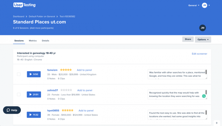
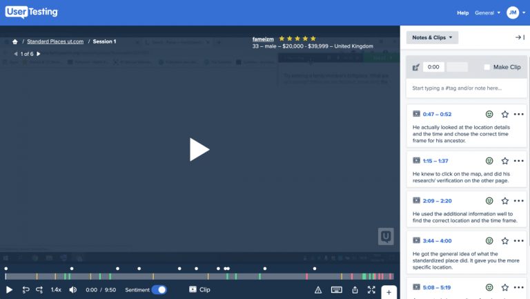
Subsequently, our developers translated these designs into functional components, facilitating further testing to refine the user experience. Collaborating closely with developers throughout the implementation process, I oversaw the creation of working prototypes and conducted usability tests using platforms like usertesting.com. Insights gathered from these tests informed iterative improvements to component functionality, ensuring alignment with design specifications.

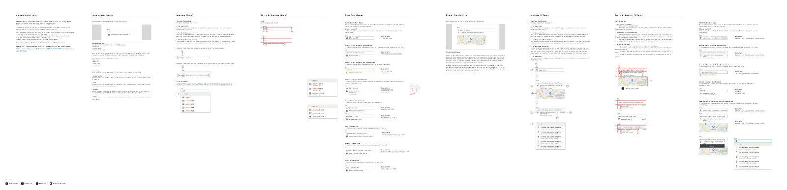
To ensure global usability, we conducted diverse tests with participants from various backgrounds and countries. This approach was vital, especially for components like the Standardizer, where cultural differences played a significant role in user interaction, allowing us to refine designs effectively. 

Given my limited knowledge of how Chinese, Korean, and Japanese cultures approach dates, I relied heavily on developers and product managers for insights, asking numerous questions to fill the gaps. Usability testing unveiled that these cultures don’t utilize calendar selectors for dates as in Western cultures. Instead, they often associate dates with historical events like dynasties or rulers, prompting necessary adjustments in the components.

Documentation

During the process of creating a design system, we realized that the documentation of components was just as important as the actual designs. To help users feel comfortable using our product, we wanted all icons, colors, and styles to have the same affordances across the site. In order to achieve this, I began keeping carefully documenting findings and instructions on how to implement the components in designs. This documentation was important not only for the designers to correctly use these designs, but it also helped the developers build the components as designed. 

Figma Library & Implementation

We built a comprehensive Figma library of design components to save designers time and enable them to focus on usability. Features like auto layout and constraints make components scalable and editable. For designers less experienced with Figma and components, I created a playground file to facilitate learning. 

I effectively garnered adoption and enthusiastic engagement from our team comprising over 50 designers. Through thorough communication, demonstration, and some one-on-one support, I ensured that each member fully embraced the benefits and utility of our Figma library. This widespread adoption not only streamlined our design process but also fostered a culture of collaboration and efficiency within the team.